Wednesday 7 October 2009

Modern Art- do you like it?

As much as I try, I really struggle with some modern art. We were always dragged round the Tate and other modern art exhibitions being encouraged to find something we liked to write an essay on back at school but I really struggled. The Louvre is completely different, to me that is talent, real art. But the following pieces i really cannot understand!

Tracey Emin 1998


R. Mutt 1917


Tuesday 6 October 2009

Is packaging as important as the contents?


I read the following article about perfume bottles and I thought it was amazing how perfumes started as early as Egytian times as a very functional necessity to cover up unpleasant odours or embalm the dead and a bandage soaked in fragrance worked just fine but now designers spend thousands of pounds producing the ultimate bottle shape and this has become as important as the contents!


Walk into any cosmetics department and the sweet smell of perfume fills the air. You can choose from designer brand names such as Christian Dior and Chanel to celebrity endorsed scents by pop princesses’ Jennifer Lopez and Brittany Spears. But from a collectors point of view it is not the smell that entices them to the shelves but the collectability of the innovative designed bottles. Throughout the ages perfume has been packaged in various shaped bottles made of many different materials. The ancient world used blown glass and alabaster whilst the Victorians favoured silver topped glass bottles. One of the most collected Victorian bottle is the dual-purpose double-ended one, two bottles fused together they are usually found in green, ruby or blue coloured glass, one end contained the flowery scent that the Victorian ladies liked to wear and the other for their smelling salts.

It was the turn of the 20th Century when the perfume industry began to introduce pre-packaged scents for women to buy directly over the counter. Perfumeries commissioned glass manufacturers like Baccarat and Lalique to produce high quality bottles to house these scents. The Lalique ones have become highly sought after by collectors and some command big money at auction, a rare “Bouchon Mures” Lalique bottle was sold at Bonhams saleroom in 1990 for a staggering hammer price of £38,000.
Baccarat was other leading glass manufacturer that created amazing innovative bottles to house ladies scents. One of their most recognised designs was for French Perfume house “Guerlain”. The bottle has an inverted heart shaped stopper and displays the “Guerlain Paris” label on the front. “L’Heure Bleue” was the first scent to be launched by Guerlain in this bottle in 1912 and they used the same design for “Fol Arome” and “Mitsouko” in the following years.
Today there is a huge array of different scents and novelty bottles to choose from in the commercial perfume industry but collectors are also attracted to the studio glass bottles that are skilfully made by various glassmakers. All leading manufacturers of these art glass creations, each bring a different trait to their trade and have their own personalities imprinted into their designs, these bottles are made as decorative pieces rather than functional and are to be displayed and admired. Look to manufacturers such as Isle of Wight, Okra and Glasform for high quality hand created art glass perfume bottles.
As with any female fashion collectable such as handbags or jewellery, perfume bottles really came into their own in the 1920’s. Women became more aware of their looks embracing the Jazz Age with vibrant colours, short skirts and even shorter hair. Many designer houses moved with the times and encouraged the women to complement their looks with classy scents in stylish bottles. Perfume bottles have formed a large part of our social history, the materials used and the designs created reflect centuries and decades long since past; giving us an insight into the development that peaked in the 20th Century.

How important are the colours you use in your brand?

Does colour matter in a brand and how important is the colour to the sales of the product? When I think about Carlsberg the first thought I have is green followed by their slogan "Probably the best lager in the world". I think their advertising is superb! But why choose green? I have done considerable research into the reason why Carlsberg would have chosen this colour. And i have two theories! The first is that the origin of Jacobsen the founder of Carlsberg came from Jutland. This is a beautiful totally green landscape where grass and trees stretch as far as the eye can see. The second is more of an allegory - Green signifies growth and abundance and the tie between beer and hops and nature could have influenced their decision to choose green.


The brand of Dove reminds me of smooth skin and naked women because that is what I have seen on TV advertising. The colours they have used are blue and white and again blue is calming and evidently one of the most popular universal colours. In 2008 Pantone choose the colour Blue Iris (PANTONE 18-3943) as its colour of the year!


I thought of Coco Cola and it reminded me of the colour red! Which actually on a side note is interesting considering my blog about colours and moods and how red is a very dominant colour which is a stimulant and increases the blood pressure! So did Coca Cola think about that when they developed their brand?

Colour and Me

One thing that has always fascinated me is the effect that colours have on people. Whether it is to do with their moods or they dress in a colour to make a statement about themselves, whether colour is to denote an emotion or merely because that colour suits their skin tone better than any other I love the effect colours have.

Look at this in more detail - lets explore each colour.


Green is the most peaceful colour of all. Think about green! It evokes instant thoughts of forests and woodland, of green fields and perfectly mown lawns! Green makes people relax and unwind and promotes peace and harmony in a living environment.

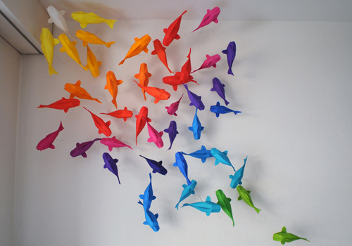
Orange is the most energetic colour and represents excitement and enthusiasm. Orange was used in ancient times to heal the lungs and increase energy levels. Many interior designers encourage it for exercise rooms, but it has more negative impacts in other rooms.


Red
makes a real statement. You always notice someone in red and it is a colour associated with some favourite occasions such as Christmas and Valentines Day. Red makes people think of special times- red roses for love, poinsettias for Christmas. Red raises a rooms energy and makes your adrenalin rush! It stirs the emotions and you never forget a "Lady in Red"


So onto my next colour - blue! Blue flowers can be found at both spectrums of emotion! Wedding flowers often contain delphiniums, veronica, sea holly and wisteria whilst at funerals you can find such flowers as lilies or iris. Dark blue can evoke feelings or sadness whilst sky blues create a feeling of calm and relaxation.


Yellow
in the flower world mean sunflowers, winter flowering jasmine, daisies, alstromeria. These flowers are cheerful flowers which bring a smile to a dull day! Yellow is sunshine and happiness but by reverse in studies yellow is not necessarily a good choice for a room decor. Research shows that people are more likely to loose their tempers in a yellow room and babies cry more! The main time yellow is an asset to a house is in a small enclsoed space where yellow can create a feeling of space! And yellow is also a tiring colour - it does not create a feeling of peace and calm in an environment.


The neutral colours such as black, white and beige are flexible colours and whilst going in and out of trends do not have as much psycological impact as the others, although black is recommended in small amounts.


And so to the world of design - what fascinates me is why do people choose a colour? What does it say about them? Does colour affect my mood? Does colour affect yours? Does it make people buy things? Does it make people more succesful?


Folding Paper Guy!

SIPHO MABONA

Someone, had mentioned this guy to me and I then came across him in a newspaper. Despite the fact that I would never pay for one of the paper sculptures, I think they are really incredible and this is a really talented and creative guy. His designs are so intricate and some take him up to 20 hours to fold, they are all done out of one sheet of paper and can take up to six months to design. He folded his first paper plane at five years old and is now folding creations which are being exhibited all over the world, from Japan to France and Switzerland to Canada. Some of his designs sell for more than £1500.
I think this guys work is amazing and its really nice to something new and original being designed.


Hmmmm...

I saw this article in The Sun and didnt really know what to think about it. Was she really hired for her 2:1, despite the fact that many other students out there with the same qualification are struggling to get work? Or did she genuinely excel in an interview and deserves the job?


Natalie Brown


THE brainy beauty told she was too glamorous for a job is being taken on by a top advertising agency - thanks to Sunemployment.
Natalie Brown, 21, is all set for a placement at prestigious London firm M&C Saatchi.
We told yesterday how she was devastated after being told to "tone down" her pretty image by a small marketing firm. But she can now launch her career with the very best.

Natalie, of Holland-on-Sea, Essex, said: "It's a dream come true to be taken on by such a prestigious company. I am over the moon."
After reading about her case in The Sun, M&C Saatchi called her for an interview to fix details of a three-month placement.
The firm was set up by a founder of Saatchi and Saatchi - the famous company behind the iconic election poster "Labour Isn't Working", which helped the Tories sweep to power in 1979.
An M&C Saatchi spokesman said: "The group prides itself on only employing the best brains in the business.
"We admire Natalie's entrepreneurial spirit in contacting The Sun to tell her story.
"If she is as brainy as The Sun says she is, then we would love her to work with us. As such we have offered her a three-month work placement to show us how good she is."
She will help with the PR for massive firms like Coca-Cola, Reebok and Carlsberg.
The beauty - who has a 2:1 degree in advertising and marketing - turned down a job at a marketing firm after being told her looks might "give the wrong impression" to clients.
Natalie, currently waitressing, said: "We learned about Saatchis at uni. I never dreamed I could be working for such an amazing company so soon."

Best Way to Advertise

What is the best way to advertise?

This video has been created by Peter Watkins-Hughes to show round schools to act as a warning to young people about texting and driving.

This video made me think about the best way to get across a point to its audience. For me if this came on television I would simply change the channel-thus making it a pointless advert, for some people it may have a genuine impact. However, the adverts which portray road safety through the hedgehogs, despite not having the shock factor would make me think more, as I would actually watch them. Seeing this latest texting video made me think about what is the best way to advertise?

Probably the best larger in the world

Over the Summer I heard an advert on the radio for Carlsberg where it goes something like this 'The 2010 world cup is moving from South Africa to England, Pele has realised he was actually born in Birmingham...etc'

I thought this was brilliant as it really captures your attention (although it does annoys lads when they realise its not a real news bulletin)

All the Carlsbergs ads are really easy to watch and are almost like short films. The slogan 'Carlsberg don't do....but if they did they'd probably be the best in the world.....' is so easy to remember. These are probably my favourite adverts on tv.

To see these videos copy and paste this into the browser (I couldnt upload due to copyright)

http://www.youtube.com/watch?v=3P_API6N4oA (If Carlsberg did flatmates)

http://www.youtube.com/watch?v=fK3vF2Y-l3g&feature=related (If Carlsberg did nightclubs)

http://www.youtube.com/watch?v=RojpJ843Mko&feature=related (If Carlsberg did dreams)

http://www.youtube.com/watch?v=ciWtiX_kJv0&feature=related (If Carlsberg home delivered)

Painting of a Hero

Painting of VC Hero

I saw this article in the metro and thought that it was not only a great painting but it was a really emotional story of heroism.
The painting was done by Stuart Brown a military artist, and was commissioned by Cpl Bryan Budd's 3rd Battalion Parachute Regiment in Colchester to honour him. It shows him fighting the enemy single handedly, despite being injured and out numbered. Cpl Budd was posthumously awarded the Victoria Cross.
I thought this painting and story put a lot of life in perspective...


Graffiti-Art or Mess?

Graffiti-Art or Vandalism and Mess?
Vandalism?


Art?


Vandalism?


Art?


Art?


When I was in Spain I noticed a really interesting piece of graffiti. it was of a landscape and had a lot of intricate detail which many paintings do not have. Unfortunately we only past it on the way to the airport and didnt have time to stop and get a picture of it. It made me think about graffiti as an art, and the fact that some graffiti is truely exceptional and could not be done by many top designers or painters. Should we create someway of making graffiti more easy to do, so that it is not all over buildings and is recognised a lot more as an art form. And how do we do this without allowing just pure vandalism?

Interior Design

Andreas von Einsiedel
Probably my favourite interior designer photographer, as he manages to capture through his photographs the real feel about the room which the interior designer has conveyed through the decorating. You can feel like you are actually in the room through his excellent photography.


I love interior design, and designing the way a room looks. I think that the way your home is decorated really reflects on your everyday life. You work better and overall are happier in a room which suits the way you live and is decorated in a style which you like.

I like work by Tony Muntaner, Reinhard Weiss, Homeira Pour Heidari, Nona Von Haeften and Amanda Eliasch. These interiors designers all have different styles but really capture the essence of a room and buliding.

Photography Bans

'Jail for Photographing Police'


This is an article which again shows restrictions being put on photographers, and limiting creative freedom.


Canadian Photographer

ROBERT LEON
Originally from Vancouver, Canada.
Robert Leon has travelled the world, capturing emotions, events and experiences. He has taken photos in Cuba, Greece (Santorini and Meteora), Guatemala (Antigua's Semana Santa and Chichicastenango's San Tomas Fiesta etc), India, Israel, Istanbul, Lacandon Mayans, Venice, Riviera Di-Lavante, Ruta Maya, San Fermines, B.C Canada.
His photographs for me are so bright and lively you are drawn into them. You really feel like you are there with the people/person. I like the fact that, as quite a few documentary photographs do, not all of his photographs are deppressing, showing poverty and sadness. He also captures a real sense of culture about the place and the people.


Brazilian Photographer

SEBASTIAO SALGADO
He was born on 8th February 1944 in Aimores, Minas Gerais, Brazil. Originally starting off as an economist he then switched to photography as a profession, originally starting off in news journalism and then to documentary. He has worked on many books and various projects over the years, his latest one being Genisis. A project dedicated to landscapes.
I really like his work as I think he captures a side of documentary photography which is very different to other photographers. As he works mainly in black and white he expects his audience to see the colour in the photograph, translating it in their own way. His photographs are often dramatic and full of an energy which I find very inspiring.


I have always enjoyed photography, and capturing emotions and memories through a still image. However, something I have recently become more interested in is documentary photography. I like the fact that photos are taken without people knowing, so true emotions are captured. As the minute you say to someone that you have a camera or are going to take a photo their whole demeanor changes and you no longer get a natural and genuine smile or emotion.

Monday 5 October 2009

'Circle of Love'

KIM LAWRENCE
'Circle of Love' Figurines
I love Kim Lawrence range of figurines, yes they are romantic and could be seen as soppy but I think they are so elegant and well designed. They represent all those feelings between two people or parents which arent usually seen or understood by anyone except those two people.
'Infinite Love'


'Profound Love'


'Like No Other Love'


'Always'


The Power of the Media


'After 12 long years in power, this Government has lost its way. Now it's lost The Sun's support too. '
This was the statement that The Sun released recently which has caused so much controversy. Yes 'The Sun' is one of the more low budget and more 'gossipy' newspapers, however, it still has a large following of people who read it and could well be influenced by what it says. After backing labour for twelve years now it has finally lost its trust in them, have the people?
I think this article really shows the power of the media, in particular the press.